Design for Dimensions
- Group size: Teams of 3-4
- AI Policy: YELLOW LIGHT: You may use AI for certain parts of this assignment or to polish/edit your original, non-AI work. Be sure to carefully locate the 🤖 robot icons and read to make sure you align with this policy.
- Design sprint starts: Monday, September 14
- Design sprints ends: Wednesday, September 30, present @ 8:05 AM, in class, write-up due by 11:59 PM to Moodle. Design document due at 11:59 PM.
Overview
Before you begin: Read this entire document and consider how you might want to split up work.
Purpose: The goal of this design sprint is to practice responsive and contextual UI/UX design as a collaborative team. Rather than simply shrinking or stretching a layout to fit different screens, you will redesign an existing website (Carburritos) tailored specifically to the unique physical, interaction, and context-of-use constraints of three distinct device dimensions for a targeted user demographic.
In this assignment, as a team, you will learn and practice:
- Contextual and multi-device UI redesign: Learn to adapt digital interactions to different modalities, such as micro-interactions on a smartwatch (touch/crown) to individual desktop web browsing to spatial, multi-touch, collaborative wall displays (pen/touch).
- Demographic-driven design mindset: Define a specific target user group (e.g., local 50+ residents in Cornelius vs. undergraduate students) and restructure website information based on their unique goals and visual priorities.
- Rapid ideation & low-to-high fidelity prototyping: Practice rapid paper sketching (ideation), paper prototyping and testing (iteration), visual style guide creation via mood boards, and interactive high-fidelity prototyping in Figma.
- Design communication & peer critique: Present your design rationale effectively during live in-class demos using the “I like, I wish, What if” framework.
Why this matters (this week and beyond): This is your first opportunity in this class to work on a creative project as a group. You’ll grow skills in communication, leadership, professionalism, and teamwork (in addition to the technical skill of using Figma). Beyond this class, your careers will almost certainly involve some type of end-user, and learning how to effectively cater your product/software/words to different audiences and different screen sizes demonstrates that you know how to be flexible and account for a variety of possibilities.
Task
Redesign at least two pages of the Carburritos website:
- The Homepage.
- A second page directly accessible from the homepage (e.g., “Catering”, “Employment”).
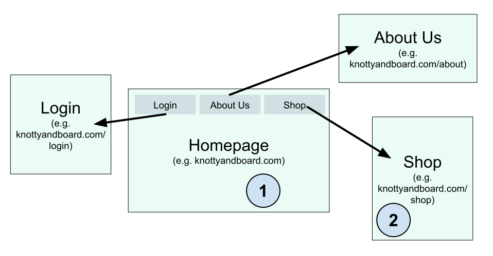 An example webpage, with additional pages linked to the homepage. The additional pages are “About Us”, “Shop” and “Login”. The students selected the homepage as one of their pages and “Shop” as their second page to revise.
You will create 3 distinct interactive prototypes (one for each screen size below), with each prototype showcasing both pages (6 total views):
- Smartwatch (Micro-display, wrist interaction, quick action)
- Laptop / Desktop (Individual mouse/trackpad browsing)
- Large Multi-Touch Display (e.g., Microsoft Surface Hub, which is collaborative, wall-sized, and uses pen/touch interactions)
Here’s the catch: you can’t just shrink or expand content to fit a different screen size, just like you can’t expect all users to benefit from the same user experience. You must consider the holistic user experience of the device, while balancing creating the best experience for a specific user group. The input modalities are different for a smart watch than a laptop. For instance, an Apple Watch has a digital crown, while a laptop does not. A large wall-sized multi-touch display is often used in collaborative settings, sometimes with pen and touch, while a laptop is usually for an individual. Likewise, designing for diners who are in their 60s has a different set of design requirements than designing for Davidson College students.
AI Policy 🤖: You are encouraged to use AI tools (e.g., ChatGPT, Claude, Midjourney, Figma AI) as a thought partner to assist with research, ideation, and asset generation. I’ll explain specifics below.
This assignment will be published on Medium so that all group members can link to the work and so future employers can read about your project. We will discuss publishing in class – if you are not comfortable publishing the work, then your group will keep the write up as an unpublished, unviewable Medium draft.
Step-by-Step Instructions
Collect evidence along the way! Don’t make writing your design doc more difficult than it needs to be!
Step 1: Define Target Demographic & Information Design
- Select a specific user demographic (who are they, what do they need, and when/why are they visiting Carburritos?). This decision will influence your design choices, so be sure to fully flesh out all the details of your user demographic.
- AI Policy 🤖: You may choose to prompt AI to explore potential goals, pain points, or mental models of your chosen user group (e.g., “What are key accessibility and visual hierarchy considerations for adults 60+ using a restaurant website on a smartwatch?”). If you choose to use AI in this way, I would use it to help mitigate biases and to look for cases you hadn’t considered.
-
Audit the current website content and re-prioritize information across both selected pages specifically for your user group. Don’t just rearrange the homepage – that was constructed for a general audience. Instead, think about the goals of your users and adjust the information/layout accordingly.
- Establish a clear visual hierarchy for the information on the webpage. Refer to course notes, 9 Information Design Tips to Make You a Better Web Designer, and Top 10 Enduring Web-Design Mistakes posted by the Nielsen Norman Group.
Step 2: Ideate and Paper Prototype (30 Sketches + 3 Paper Prototypes)
With your target demographic and information hierarchy in mind, let’s ideate what we want the website to look like.
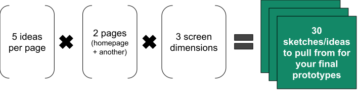 You will need to come up with 30 different ideas/sketches. This breaks down to 3 screen dimensions * 2 pages per screen * 5 ideas per page.
-
Quick and dirty ideation: Generate 5 fast concept sketches per page per device size. You should include these sketches in your final writeup.
-
To save space while still showing all 30 images, I recommend making a collage or 2-D array of the images so the reader can peruse the thumbnails of each sketch.
-
AI Policy 🤖🔴: Your ideation phase (5 concepts $\times$ 2 pages $\times$ 3 screen sizes = 30 sketches) must be drawn by hand on paper or whiteboard. AI cannot replace human paper sketching for rapid ideation.
-
-
Clean paper prototypes: Synthesize your best ideas into 3 clean paper prototypes (covering the 2 pages for each device size = 6 total paper UI screens). You should include these paper prototypes in your final writeup.
-
I should see 6 webpages represented in these prototypes: 3 screen sizes * 2 webpages = 6 paper prototype pages to create
-
The paper prototypes should look more polished and detailed than the sketches. If you hired a developer to build this website using your prototype, then she should be able to only reference the prototype to build the site.
-
-
Classroom testing: Conduct quick informal testing with classmates using your paper prototypes. Do your best to get worthwhile feedback and change your prototype accordingly. Do not reveal your target demographic upfront — ask them after testing to guess who the design was made for and iterate based on their feedback!
- AI Policy 🤖🔴: All testing of paper prototypes must be conducted with real human classmates. AI-simulated user personas cannot replace human testing.
Step 3: Visual Design & Mood Board
Construct a Mood Board (using tools like Niice.co or something as flexible as Canva) collecting visual references (color palettes, typography, UI components, tone) that appeal directly to your chosen demographic.
-
Check our design resources for other tools to help.
-
AI Policy 🤖: You may choose to use generative image tools (Midjourney, DALL-E, Adobe Firefly) to generate mood imagery, color palette ideas, or UI inspiration for your target demographic’s aesthetic preferences. You may also choose to look on Pinterest, magazines, local shops, or use your own creativity.
Define a clean style guide (colors, typography, component styles) anchoring your visual choices. You can choose to make this a separate document for your team to reference, or simply note your style guide contents in your writeup (e.g., “From our moodboard, we decided on a range of blues for our color palette with Arial font for clarity and accents of yellow for emphasis.”).
Step 4: High-Fidelity Figma Prototypes
Build 3 interactive high-fidelity prototypes in Figma (one per device size). Each prototype must show the user flow between the homepage and your chosen second page (so 6 screens should be present in total).
-
Figma is a prototyping, collaboration, & workflow platform. You have a free pro account when you use your Davidson
.eduemail address.-
Start with this tutorial to learn some basics. Feel free to search for other videos and resources – there’s plenty out there. AI Policy 🤖: You may choose to use AI tools to assist with Figma plugins, layout formulas, or prototyping logic.
-
AI Policy 🤖: To polish up your prototypes, you may choose to use AI to draft real product copy or microcopy (headings, button labels, item descriptions) for Carburritos rather than using generic Lorem Ipsum filler text. You may also choose to use their existing text or make up your own.
-
AI Policy 🤖🔴: You MAY NOT use automated layout generators (e.g., v0.dev, Relume, or automated Figma UI generators) to produce your initial screen concepts or final high-fidelity layouts.
-

Step 5: In-Class Presentation & Demo DUE BY 8:05 IN CLASS
-
Add your demo Figma links to the class outline Google Doc (link coming).
-
Present a 3-minute demo, presenting your design rationale. We’ll then take ~4 minutes for Q&A/critique.
-
Your peers will critique using “I like, I wish, What if” and attempt to guess your hidden target demographic!
Step 6: Write & Submit Design Document DUE BY 11:59 PM TO MOODLE Write a collaborative team Design Document (one per group). An example Medium post from an Emory student is here – it’s a solid enough example but I would not give it a 100%.
- AI Policy 🤖🔴: The Medium post reflection must represent your team’s authentic synthesis and design rationale.
Submission Process:
-
Post the Medium post link + all team member names to Slack #design-sprints. This shows your team members that you have turned in the assignment.
-
Submit the Medium post link to Moodle (one submission per group).
-
Complete the required Peer Feedback Form.
As with all design documents, it should include evidence of your design process. You do NOT need to create a demo video for this design sprint.
Criteria for Success
Grading is based on this variation of the HCI design rubric and individual peer evaluations via the Peer Feedback Form.
What High-Quality Work Looks Like:
-
Clear demographic alignment: Design choices (information hierarchy, UI scale, fonts, colors) clearly cater to the declared target audience rather than a generic user.
-
True modality adaptation: Layouts and interaction flows take real advantage of, and respect the physical limits of, each form factor (smartwatch, desktop, and large multi-touch display).
Rigorous Evidence of Process:
Mandatory transparency & citation requirement: If your team uses AI in any part of your design sprint, you must include an “AI Usage Statement” section in your Medium Design Document detailing:
Which tools were used (e.g., ChatGPT-4o, Midjourney v6).
What tasks they assisted with (e.g., copy editing, mood board image generation, demographic research).
Reflective Critique: Briefly comment on whether the AI output was useful or if it produced design assumptions that your team had to correct.
30 Initial Sketches: Clear photo evidence of 5 distinct ideation sketches per page per screen size.
3 Paper Prototypes: Documented paper prototypes with insights from peer testing.
1 Mood Board: Visual mood board explicitly linking colors, typography, and styling to target demographic psychology.
3 Figma Prototypes: Screenshots of your final Figma designs and the links to the interactive Figma designs. The prototypes should cover both the homepage and the secondary page across all 3 screen sizes.
Comprehensive Design Document: Clear narrative outlining design evolution, user testing takeaways, and explicit design decisions.