Introduction
Good furniture websites need to be navigational, simple, and enticing. The Knotty & Board website currently includes some redundant links, inconsistent stylistic choices, and confusing organization. My teammates and I were tasked with redesigning a prototype for this website to account for three different devices: a smart watch, a laptop, and a large multi-touch display. Throughout this process, we wanted to focus our design on the best display for aesthetic navigation. We selected the home page as well as the Interors Store page to edit. We created prototypes that prioritize the product and do not lead potential customers away with confusing or overwhelming stylistic choices. After all, plenty of users, including the user group we focused on, just want to easily shop for furniture.
Knotty & Board
The Knotty & Board website is very cute and aesthetic, but has a few areas with plenty of room for improvement. Currently, the Knotty & Board home page includes two eye-catching images of the outside of their store locations. The links a user’s eyes are drawn to are the links to each store’s page, but these pages simply act as a small buffer with a little more information about the store as a whole. Along with this, the top of the page includes the “Shop Online Now” button in a less noticeable color that can make it difficult for users to realize where they need to go to online shop. Along with this, the top left of the page includes a “Log In” button and a “Locations” button, but both are non-functional.
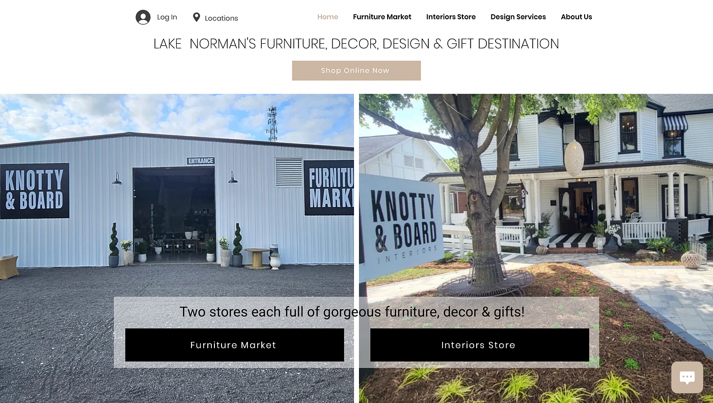
The hours and locations below take up a large part of the home page, and there is generally not much information listed on this home page. Overall, the users can be easily confused by this page and can be unsure of which buttons are meant to navigate them where. In redesigning this page, our team felt that the space could be better used with a more visible “Shop Online Now” button, more intentional use of pictures and space, and the potential for more insights into the actual items they sell.

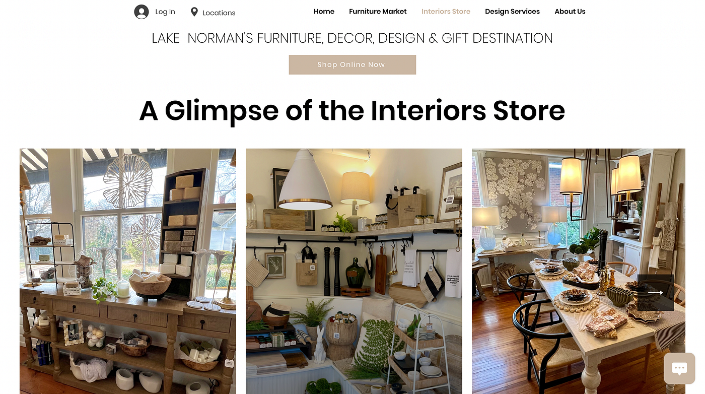
The Interiors Store page includes another large photo of the store, with a big catchy title and a button to shop the store. The location is included once again, along with hours, and then a very small description of this specific store. Our group immediately felt that the title of this page was misleading, as users would click this store to potentially already shop the store. However, they are led to just another buffer page with almost the same information as listed in the home page.

Below this large picture and description, there is the opportunity to take a ‘glimpse’ at the interiors store, but each picture is simply that — a picture. The pictures do not link to any part of the store, and they just exist underneath the very large main picture of this page. When looking at this page, we immediately wanted to improve the layout of it. We believe a better site would focus more on the description of the interiors store, rather than redundant information about the store that a user could find on the home page. Along with this, users who look at this page would probably want to see actual items or collections, and we feel that this should include better connections to the actual store items. We want this page to be a lot more clear and concise.
Planning and Priorities
In planning our redesign, the team came together to focus on a specific user group. This group we account for is users who are not accustomed to online shopping for furniture, but they do have an eye for design. They know what items they like and what they would want, but they want to be able to navigate the site easily for the best deals, quality, and reliability of items. This group would benefit from a website that is organized, while still retaining an aesthetic beauty that relates to the beauty of their products. They want a design that doesn’t make them search through redundant pagesand is clear on what is shown and how to navigate it.
The information our team wanted to emphasize for these groups includes the navigation of furniture and explanation of the site. Users don’t want to have to fight their way through a lot of fluff to look for deals and good furniture — they want to find it immediately.

Before sketching, we explored some other websites for a rough sense of their priorities and how they may differ from Knotty & Board’s. We looked at IKEA and Pottery Barn, and found that these websites prioritize a few unique things: sales & membership information, current location and log-in options, categories of furnitures, and highlights of the current season. We noticed that Knotty & Board does not include some of the categories of furniture and highlights that these other sites include.
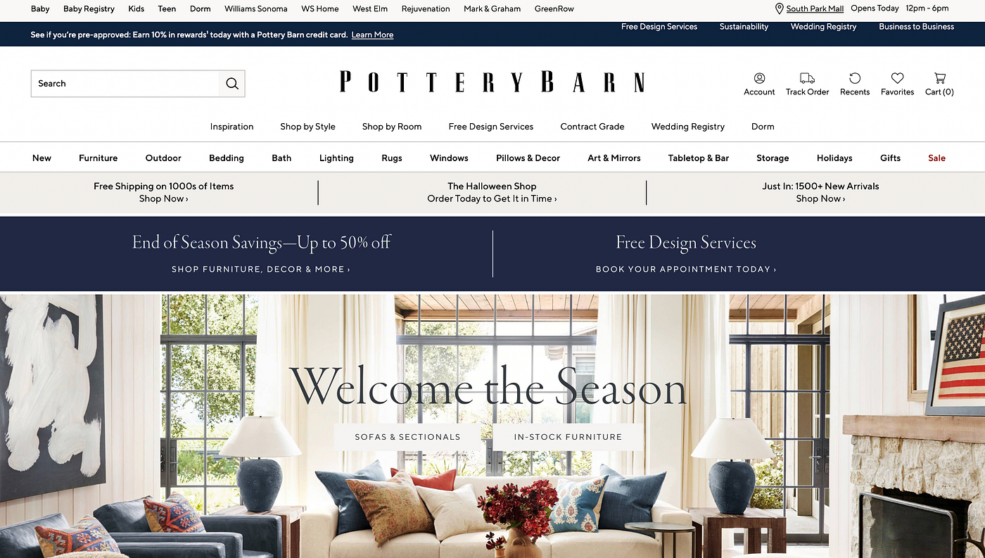
We really enjoyed how clear the websites were — the categories made sense, sales were listed, seasons were displayed, and users were aware of what they were clicking on. We wanted to implement some of these features in our updated webpage, while still keeping some of the simplicity and aesthetics that are unique to Knotty & Board.
Sketches
After exploring and discovering the areas we wanted to highlight, we began to sketch out ideas for the new look. We split our team into three groups, one for each device display, and made sure that our designs were focused on similar things throughout.
Sketches — Home Page
Smart Watch Design
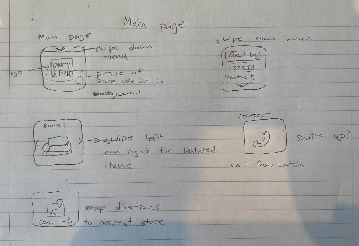
The apple watch display was tough to focus on, as there had to be some decisions made about what to display. Some of the ideas here include a swipe down menu for more options, a swipe left and right option for browsing featured items, simple map directions, or simple contact information so users could call the store from their watch. In this design, it is helpful to keep in mind the scenarios in which users would be using their watch to look at a furniture store’s site.
Laptop Design
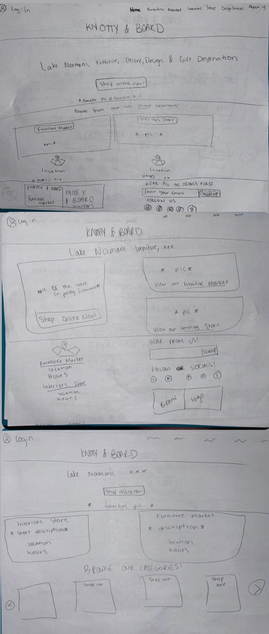

In our laptop-specific displays, we wanted to prioritize the “Shop Online Now” button in a fashion that is unmissable. It can still feature a picture of the stores, but these sketches focused on the purpose of the site: shopping for the furniture. In these images, I tried to refrain from overwhelming images or graphics that take away from that purpose. The different ideas include different options for shopping and different displays, but focus on including more categories or highlighted information. Once again, if the user clicks on an image, it would direct them to that image or category in the store itself.
Large Multi-Touch Display
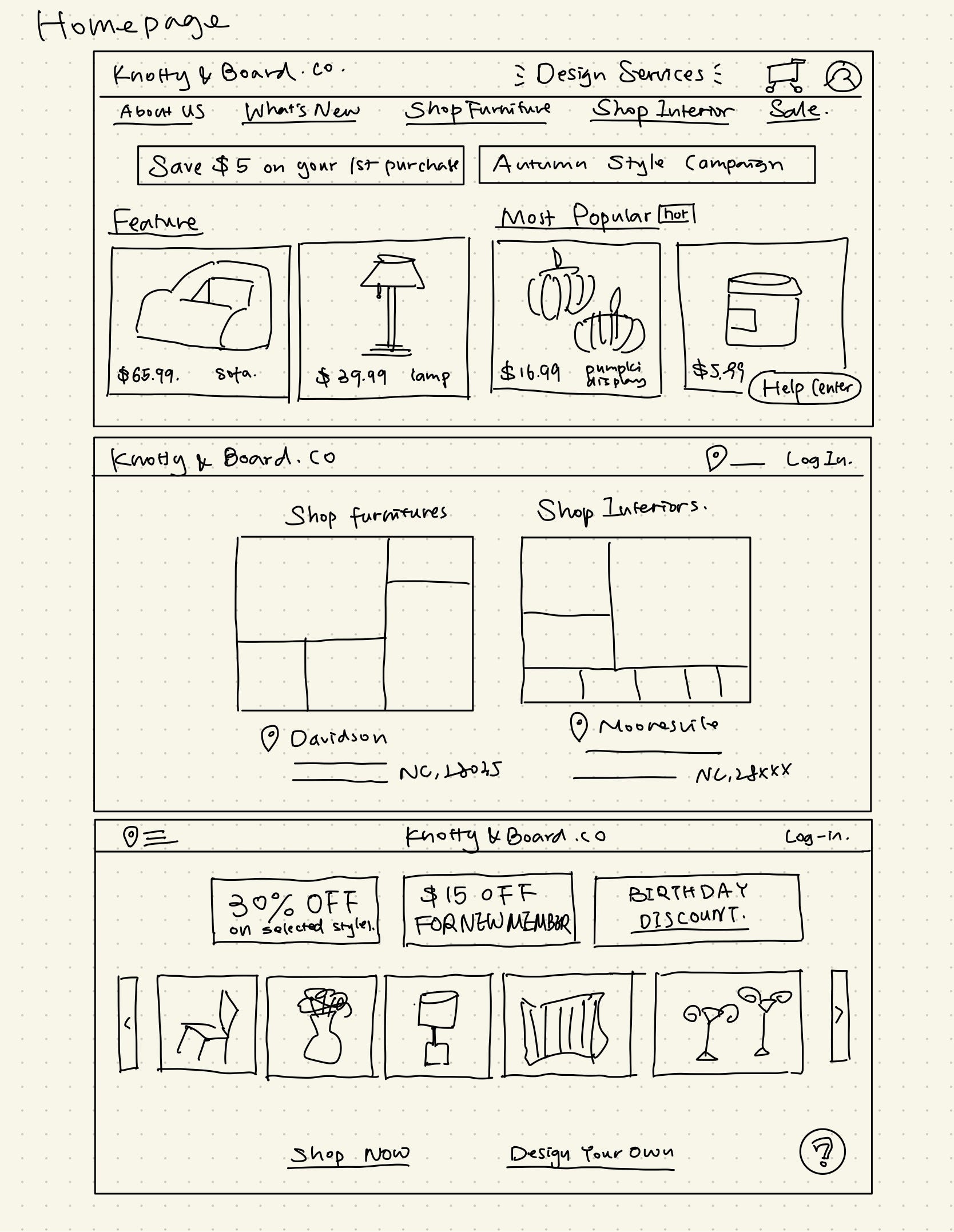
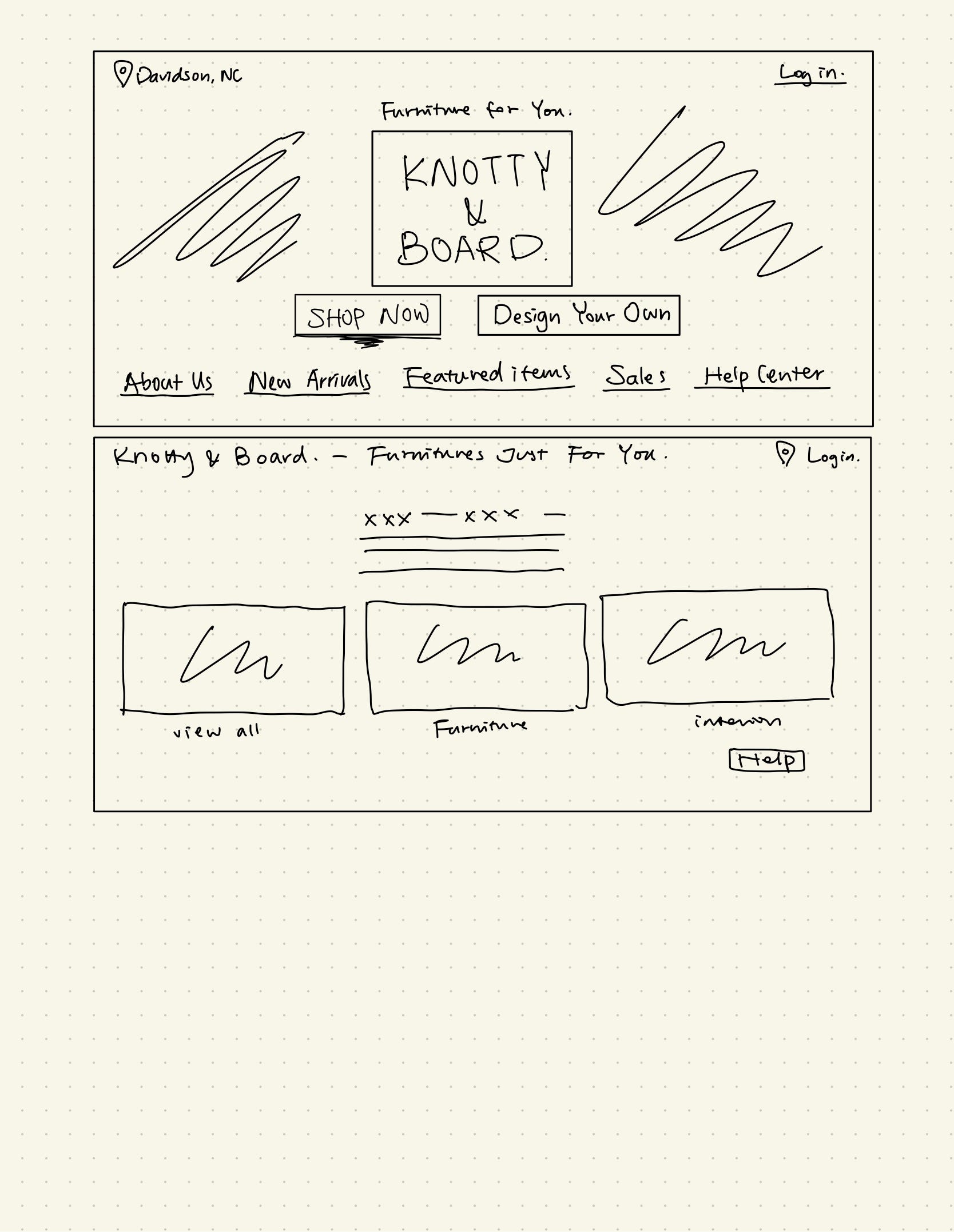
The large display options for the home screen include: sales, options for different shopping experiences, featured items, images for items, and a help center. The different ideas implement different ways of displaying information, allowing for potential separation of the stores, more simplistic displays, or different separations. Overall, this design allows for a lot more information about the items: more categories and organization of the shopping experience.
Sketches — Interiors Page
Smart Watch Design
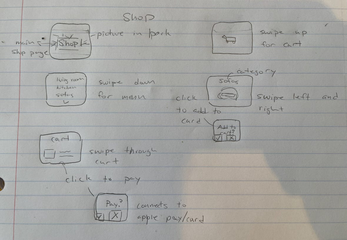
In this watch design, the different ideas account for different ways users may be looking at the Interiors Page. It includes an option for a simple picture, a shopping page where you swipe up to access the cart, a categories section that is swipe-able and you click to add to cart, or a listed category section where you swipe down for menus. Lots of options were created with the idea of keeping things simple for the user. Categories are helpful for small navigation, and the redesign could implement an automatic connection to apple pay or a user’s card to further simplify the process.
Laptop Design
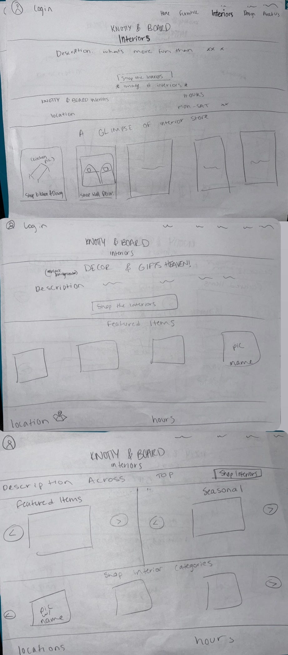
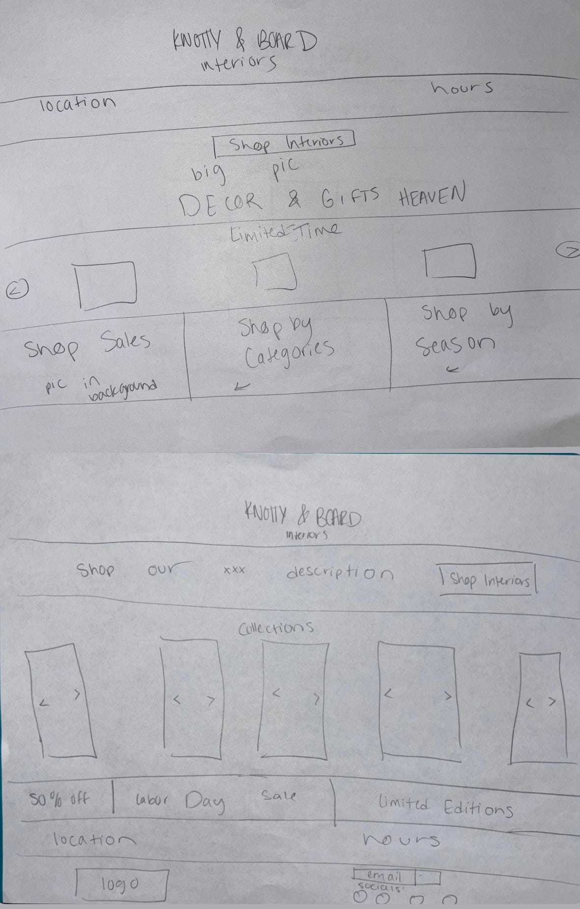
In this group of sketches, the focus was set on including more categories like sales, featured, limited time, etc. The first sketch was meant to be the most similar to the current page, with certain improvements: it prioritizes more of the description of the interiors store, and then has the ‘glimpse of the interior store’ linking to the actual store when users interact with it. The location and hours were once again moved in all sketches to not be the highlights of the page, but instead are small sections on either the top or bottom.
Large Multi-Touch Display

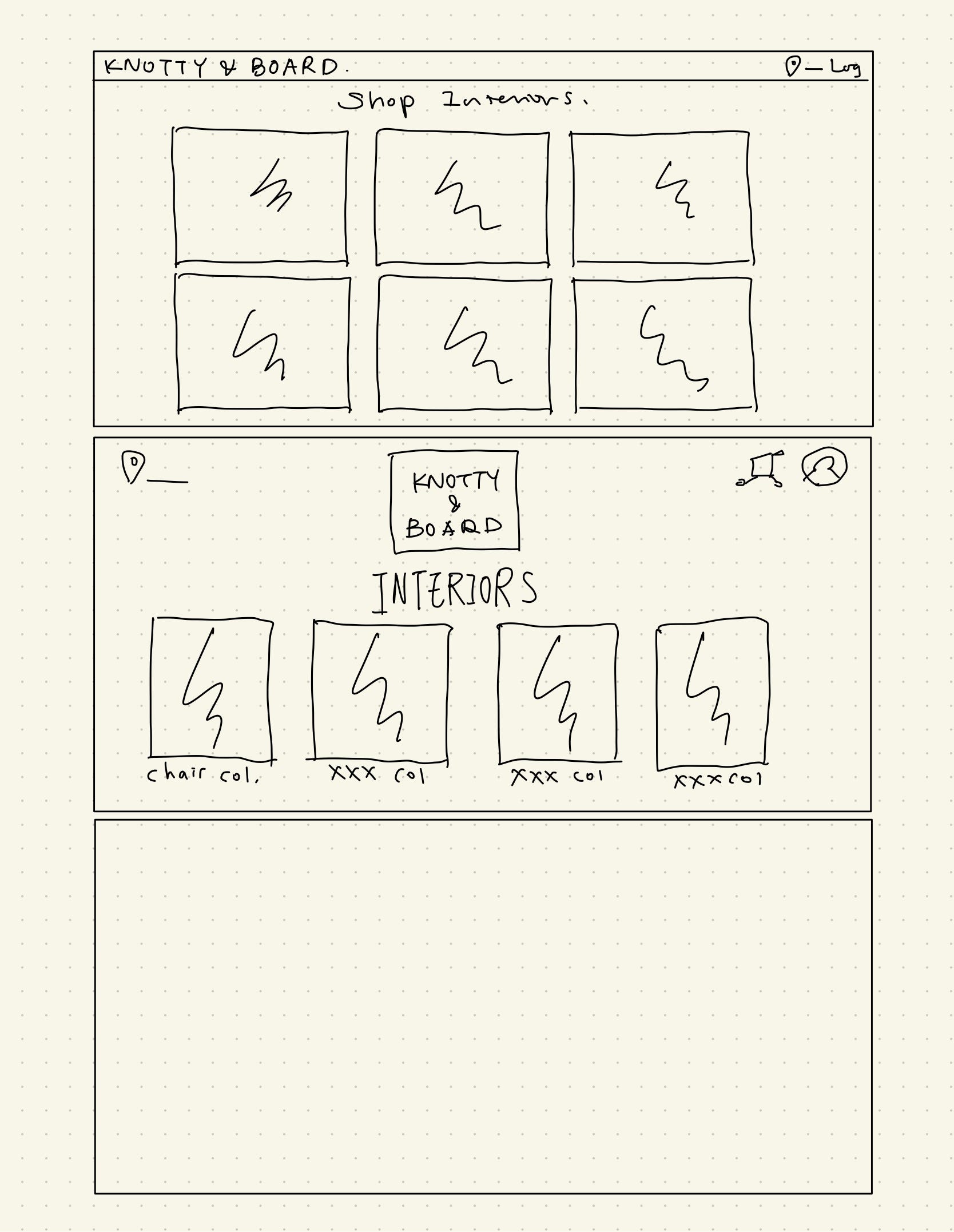
The interiors page has options listed here that would make it more of a shop than a simple page with a picture and link. Each item displayed would be there to direct them to the actual item in store for purchasing. The previous page did not include a lot of information at all. The idea with the redesign sketches was including items and more displays for the user to navigate through. These ideas included a lot of collections, and different interior-specific features of Knotty & Board.
Testing and Feedback
After creating our sketches, we wanted to get some feedback from classmates. We discussed our thoughts, sketches, and other sites we had looked at for inspiration. A classmate mentioned that they really liked the idea of a homepage similar to Pottery Barn’s. The large image of the furniture with the buttons right on top allow for simplicity while still keeping the image as a big part of it. This would be something great to keep in mind while redesigning Knotty & Board, since the previous webpage utilized a lot of large images.
Along with this, we came to a consensus on the general best things to include in each page before translating this to Figma. We decided based on feedback that it would be more beneficial to also include some collections for easier navigation from the home page. The location and hours section would not need to be as big of a priority, and would be best on the bottom of the page.
For the Interiors page, we came to the conclusion that an inclusion of categories that link to the shopping page would be best. In this way, users can browse the interior-specific options and can look more closely if desired with a simple click.
Mood Board
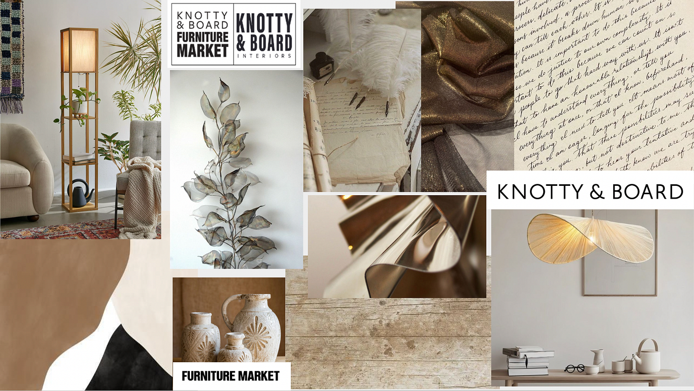
After getting feedback, we created our mood board, which includes the images and color schemes we would use as well as the fonts we were taking inspiration from. We wanted to keep the design consistent with some of the aesthetics from the store, so we used similar color schemes as some of the items in the website.
Final Figma Prototype
We finally created our updated Prototype of our redesigned furniture store website. We used the input from our classmates as well as a combination of some of our laptop and large display choices for a baseline in our Figma creations.
Smart Watch
Our completed prototypes on the watch include a home page that is aesthetic but simple. The user can swipe down to access more information and different sections, or they can swipe right to simply browse furniture. They can also view the locations for each store by swiping up, which leads them to a map to get there. In this way, the user is able to view furniture and general information, as well as access the store if they want to.

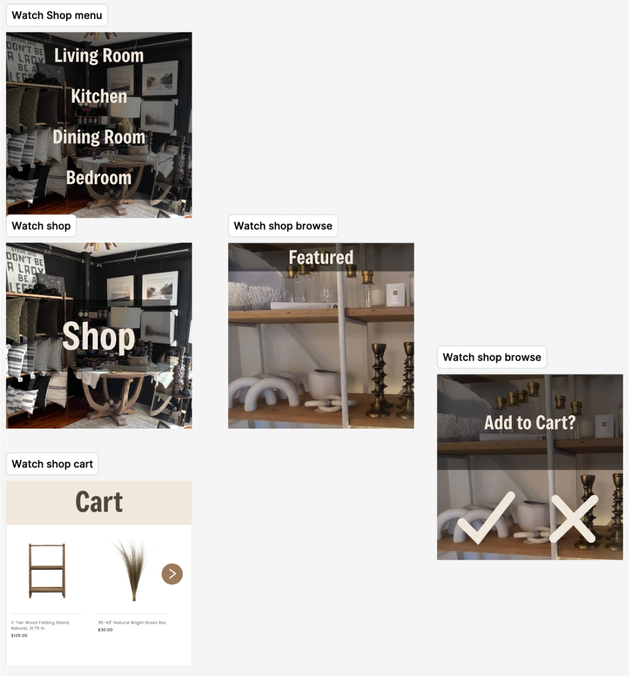
For the Interior design page on the watch, we included a menu for different sections of shopping that a user may be looking at, as well as another featured Browse section. The user can swipe down for the menu, and can tap left and right when browsing to view different products. They can select the item by clicking and then can add to their cart and check out.
An emphasis in these final designs was utilizing the users swiping abilities for the necessary functions within an online furniture website.
Laptop
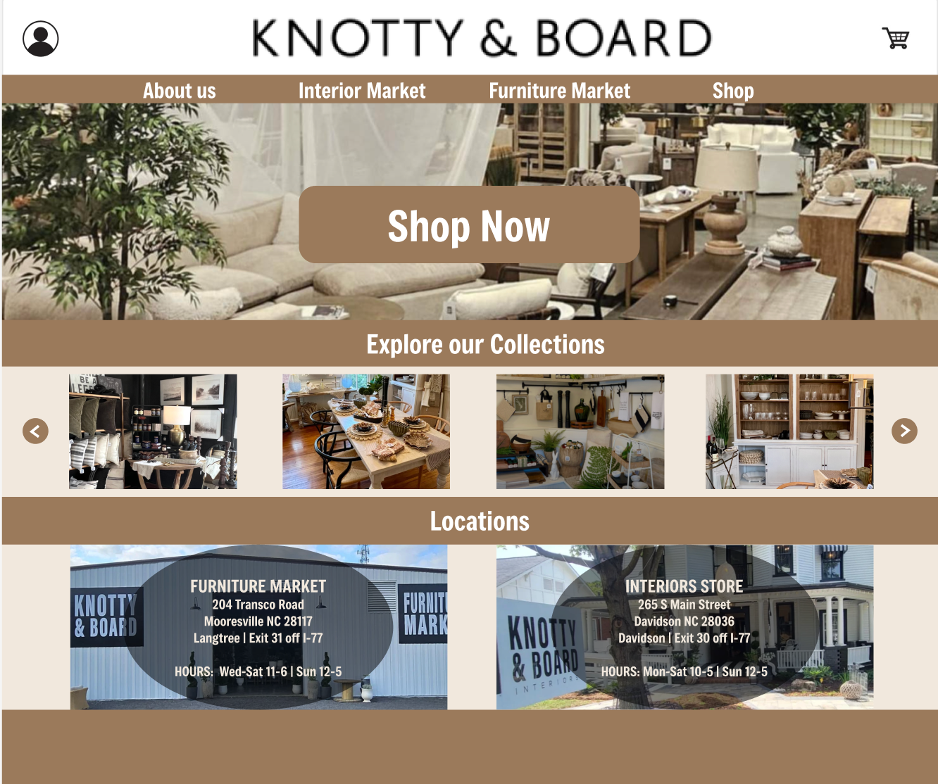
The final laptop display page includes a profile on the top left corner and a shopping cart on the right. Below the large title of Knotty & Board, we include sections that the user can interact with. On the home page, we include the large photo of the store, with a Shop Now button that users simply cannot miss. If they want to explore more, they can see collections right from the main page that will link to the collection in the shop. The locations are lastly listed on the bottom, still including the pictures that were on the previous home page.
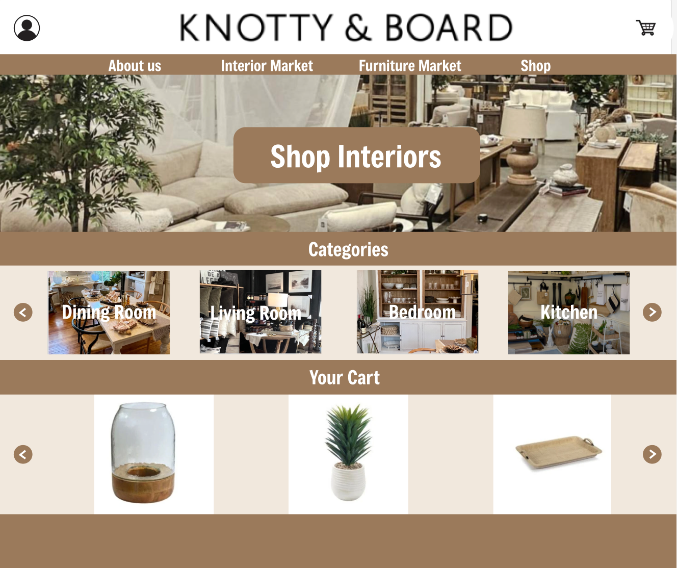
The interiors page includes the same carried over features, but the Shop Now button became a Shop Interiors button. This means that the user would be taken directly to that specific store’s shopping page. If the user wants to explore more, they can browse different categories of the Interior’s products, or can view their current cart below.
Large Display
The large display of the home page includes the option for a user to view featured items, as well as popular items, with the top four linkable sites still available (About Us, Interior Market, Furniture Market, Shop). The user can also see the specific information about the Furniture Market and Interiors Store, and if they click on one of those pictures they will be taken to that site as well. Lastly, there are some larger images of the collections for users to browse through on the home page before going directly into the shopping experience. We created the large display pages as if the user is viewing multiple screens at once, so they can see different things at one time with the enhanced larger view.
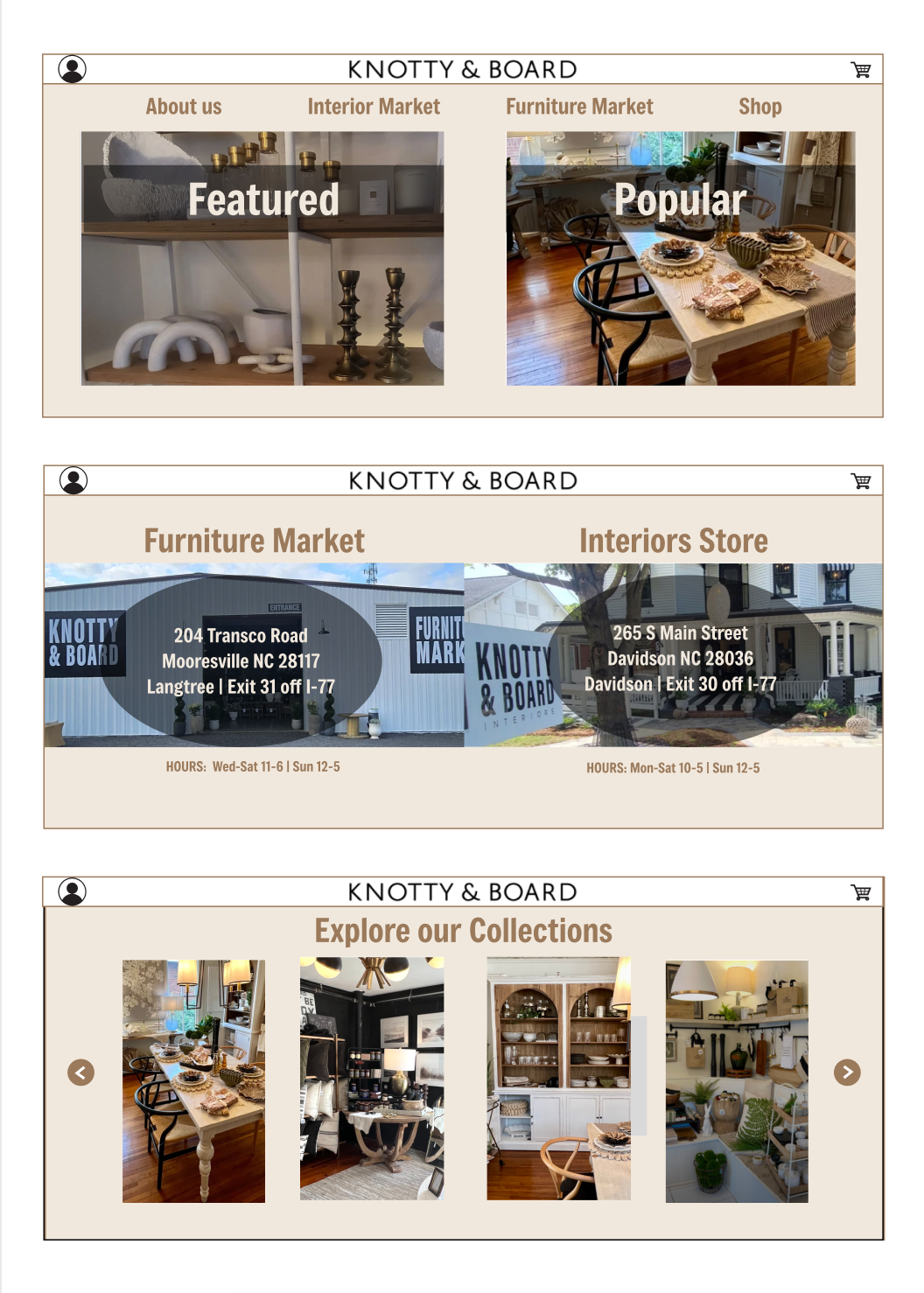
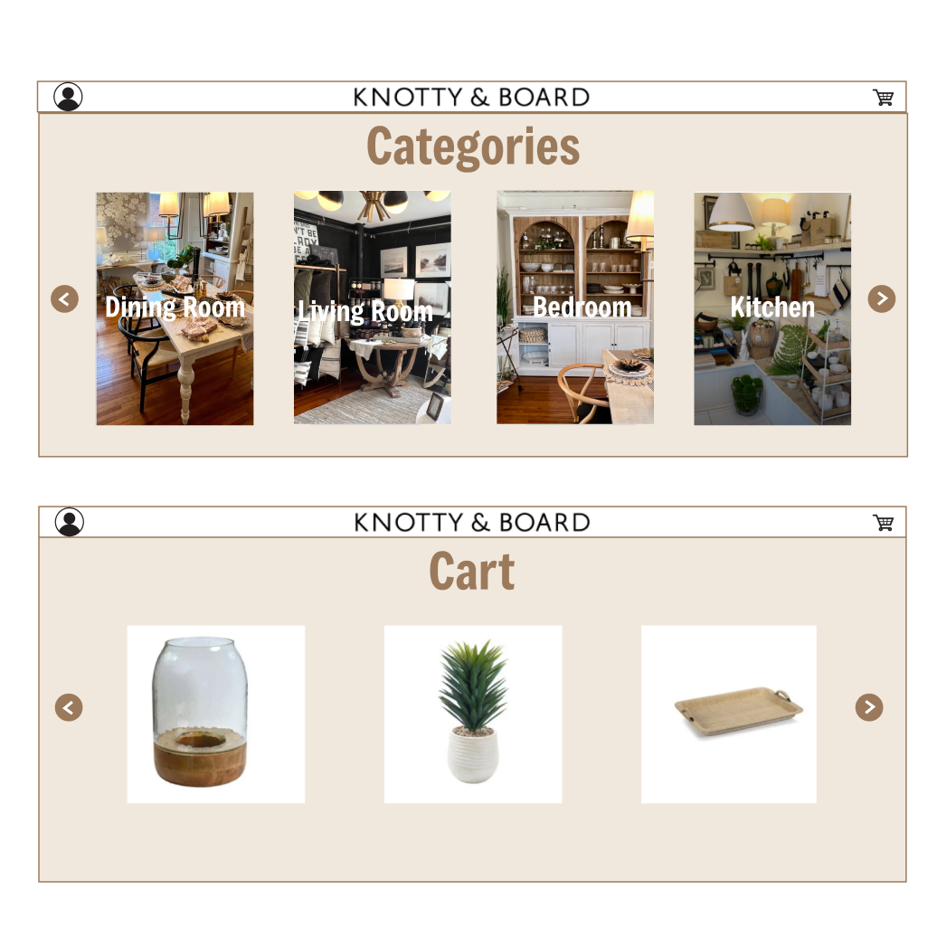
In the last section, the Interiors page, the user will have the option to view by categories, and view their cart. The strengths of this page is the opportunity to see the furniture in more detail and in larger photos with interactive elements.
Some of the weaknesses in our overall prototypes include our misunderstanding of the large multi-touch display screens. We interpreted the design and focused on a split screen rather than overall larger design. If we had more time, we would brainstorm better ways to organize even more information into an aesthetic, interactive, large display furniture store. Along with this, we wish we had the time to add in some of the specific information on the bottom of the page into our actual designs: the opportunity to join the email list, access socials, and view the logo.
Feedback
In class on 9/23, our team received some feedback after displaying our demo. The comments received included switching our order of selecting an item on a watch: left versus right. That is a super quick change that we immediately implemented to fix that display.

Next, we were asked about the blank spots on the bottom of the pages. This was where we were wanting to implement the email list, socials, and brand logo.

Lastly, we got a comment requesting a larger size on the Apple Watch cart. It makes it tough for users to see the specifics of an item when the font is too small. We were not able to implement this change during the project, but this is an edit we would make with more time and resources.
Conclusion
This process was truly interesting and informational. Looking back, we would have preferred to get lots more input from a variety of ages of people in our user group. It would have been beneficial to hear their biggest struggles, as well as getting their feedback on our prototypes. With more time and resources, we could have implemented a more iterative improvement process of this design. We also wish we were able to learn a little more about the large multi-screen displays before creating our designs, as we had some misunderstandings over the purposes of it and functions. Overall, we truly enjoyed getting to dive in and learn more design skills and tools.
